
Color Psychology in Graphic and UX Design
Which color scheme should you choose for your brand and design? Here’s everything you need to know about color psychology in graphic and UX design.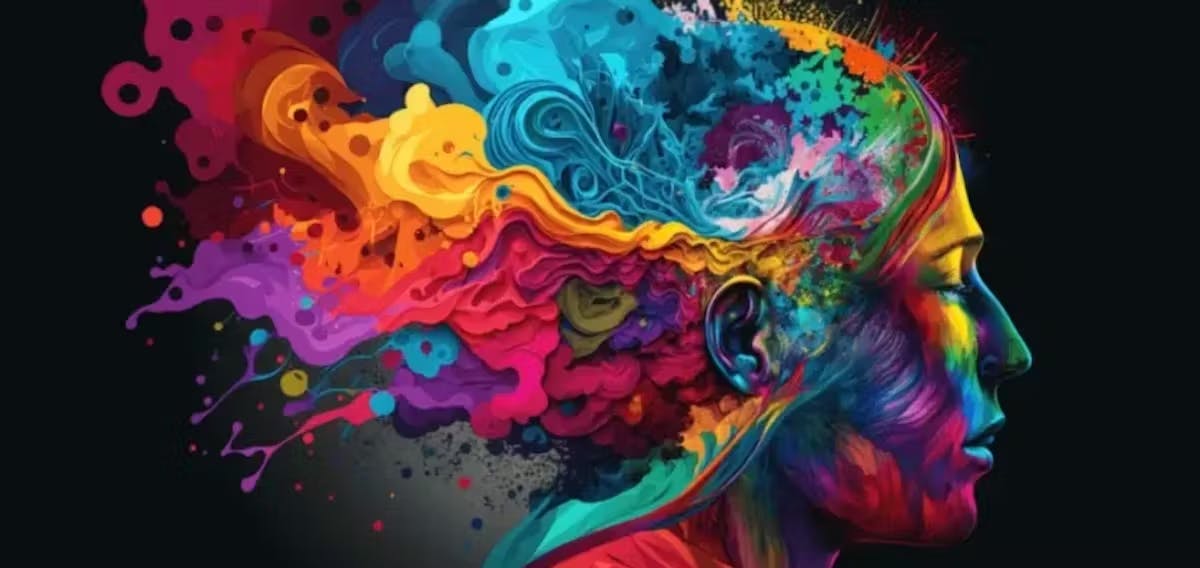
Colors are more than just visual elements—they have powerful impacts on how we feel and behave.

Have you ever walked into a cafe for a cozy hangout with a friend over a comforting cup of coffee, but were met with a busy-looking interior design and an over-energetic color scheme? Something about it screams “too much,” and you opt for a more relaxing setting. It’s because the colors made you feel uneasy and completely changed your mood.
For the same reason, hospitals often cover their walls in soft greens—for a calming effect— lingerie stores use feminine and rich “desire tones,” such as deep reds, soft purples, and blush pinks, and technology stores often choose clinical black-and-white designs for a clean and functional feel. We are subconsciously drawn to or deterred by specific places or products, but don’t always recognize why we make one choice or another.
In both graphic design and UX design, understanding how colors influence emotions and perceptions can significantly enhance the effectiveness of digital sales. With a bit of knowledge and creativity, you can wave the magic wand of color psychology and apply it to your marketing strategy—results guaranteed.
Let’s start with the 101 of color theory and explore how different colors can be used strategically to create engaging and user-friendly experiences.

Color Effects in Graphic Design
In graphic design, colors are chosen not only for their appearance, but also for their ability to convey certain messages and emotions.
According to Platt College, here’s what different colors generally communicate:
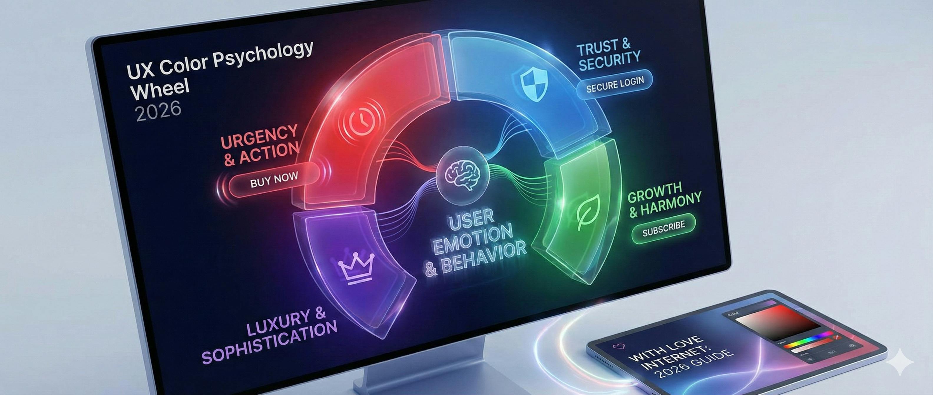
Red: evokes energy and urgency; often used for attention-grabbing elements like alerts or calls to action.

Blue
conveys calmness and trustworthiness, making it suitable for professional and reliable brands.

Yellow
represents optimism and creativity, but should be used sparingly to avoid overwhelming users.

Green
symbolizes nature, health, and growth; commonly used in environmental and health-related designs.

Purple
suggests luxury and creativity; often used in design to evoke a sense of sophistication.

Black and white
while not colors, they play crucial roles. Black signifies authority, while white suggests simplicity and clarity.

Think of your favorite brand and how its color scheme draws people in. As it gains popularity, people will forever associate those colors with that brand. For example, McDonald’s uses yellow in the “golden arches” for a happy and optimistic feel, with red to grab your attention. Apple uses black and white to exude clear-cut technology that’s fail-proof and instills confidence.

Applying Color Psychology in UX Design
In UX design, colors are strategically used to guide users and create intuitive interfaces. Look at it as helping the user through color. Rasmussen University explains how colors influence user perceptions and usability:
- Color hierarchy: use contrasting colors to highlight important elements like buttons and links, guiding users’ actions.
- Brand identity: choose colors that reflect the personality of the brand you’re designing for, to create a cohesive and recognizable experience.
- Accessibility: consider color blindness and visual impairments when selecting colors, to ensure readability and inclusivity. As a designer, avoid using colors that are too similar and might blend together (like light grey on white). Also, be careful with red and green together, because some people can’t tell them apart. We often use this tool from Coolors to test our text background colors and make sure they’re compatible with W3C standards.
- Emotional impact: different colors provoke specific emotions, influencing how users interact with the interface.
- Cultural sensitivity: colors can have different meanings in different cultures, so designers should be mindful of global audiences. For instance, in Western cultures, the color red often signifies passion and love, whereas, in some Eastern cultures, it can symbolize luck and prosperity.

It’s important to think about your target audience and the message you are trying to convey, so do research the demographic and geodemographics of your audience to avoid inaccurate—or awkward!–first impressions.
For example, suppose that many of your customers are of a specific country, culture, or religion. In that case, some countries will ban products or services with color schemes similar to an enemy flag, be deterred by certain colored animals such as black cats, due to superstitious beliefs, or have a bad reaction to a rainbow design, as it’s considered controversial.
Remember, you aren’t trying to please everybody, but aim to please your core audience.

Practical Tips for Using Color in UX Design
Now that we’ve added some color to our artist’s palette, let’s go over the dos and don’ts of design. Here are some practical strategies for integrating colors effectively in UX design.
- Number of colors: choose one to two main colors that stand out and can be used as attention-grabbers for your CTA and links. Choose three to four secondary colors to use for your backgrounds and typography.
- Primary/action color usage: use only one main color in each section of your website or app, to keep your design as unfussy as possible. A page with too many colors is like a restaurant with too many menu options—it leads to consumer fatigue and confusion. Make the choice easy for your users and direct them to the most important action you want them to take with minimal action colors.
- Contrast: ensure text and background colors have enough contrast for readability, especially for users with vision impairments.
- Consistency: maintain a consistent color scheme throughout the interface to reinforce branding and visual coherence. We love using Coolors, a helpful tool for generating a color scheme.
- Feedback and interaction: use color changes to provide feedback on user actions, such as button clicks or form submissions.
- Visual hierarchy: use colors to guide users’ attentions to key elements and information on the screen.
- Testing and iteration: experiment with different color combinations through testing to determine the most effective designs for users.

Colors and Choices
Colors are powerful tools in design, influencing user emotions, behaviors, and perceptions. By understanding the psychology of color and applying this knowledge thoughtfully, designers can create engaging and user-friendly digital experiences. Whether you’re aiming to convey trust, encourage action, or improve usability, the strategic use of colors can significantly enhance the success of your design projects.
This is where you get to add the final touches to your projects, products, and services, so remember to have fun while you bring your vision to life through color.

If you need help growing your business and advice on how to use colors in design, make sure to get in touch with our marketing experts for a consultation.