Creating The Ultimate Homepage Using HeroGuide
These are the best homepage practices and how to create engaging, precise copy that fully shares your story and the reasons potential clients need you.
We’ve all heard the saying, “Don’t judge a book by its cover.” But no one takes that saying to heart when it comes to a website’s homepage.
A recent study* showed that you only have 50 milliseconds (0.05 seconds) to make an excellent first impression on new viewers on your website. To put that in perspective, it takes 100 milliseconds to blink! This stat is why your website’s homepage organization, clarity, and vibe are essential to keep users on your site and land new clients.
" If you’re kicking off your website journey, the first page you’re going to want to ace is your homepage "
If you’re kicking off your website journey, the first page you’re going to want to ace is your homepage. This article will delve into the best homepage practices and how to create engaging, precise copy that fully shares your story and the reasons potential clients need you.
However, if you are curious about the process of building a fully customized website, we’ve already made a definitive guide, walking you through the development process from start to finish. Check it out:
Your Definitive Guide to Building a Powerful, Custom Website
What is a Homepage?
For clarity’s sake, what is a homepage? A homepage is the first page of your website. It sets the stage and tells the story of your business. Simply put, your homepage will occupy the root domain of your website (e.g., withloveinternet.com) and contain easy navigation to other pages and resources on your website.
" A homepage is the first page of your website. It sets the stage and tells the story of your business "
However, it is much more than that. The homepage will ultimately make or break your website, catching potential clients and guiding them to your solutions – or turning them away. It’s essential to be strategic and immediately clear about what your business is and how you can meet their needs.
" It’s essential to be strategic and immediately clear about what your business is and how you can meet their needs "
How to Create Home Page Clarity
When working with clients at WITH LOVE INTERNET, we like to call this phase the “Messaging Phase.” This is the first and most crucial phase of website development because the goal is to understand the message you want to get to your audience for optimal digital growth on your website. At WITH LOVE INTERNET, we approach this phase using the HeroGuide philosophy.
" The HeroGuide philosophy means that our biggest goal is to understand your company’s heartbeat and story and invite your audience into it "
The HeroGuide philosophy means that our biggest goal is to understand your company’s heartbeat and story and invite your audience into it.
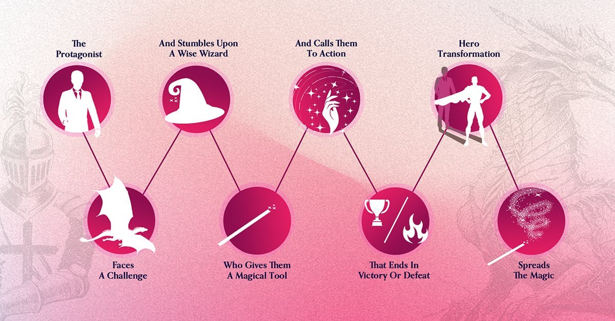
A story in the rawest form looks like this: a beloved CHARACTER (your customer) encounters a difficult PROBLEM. A GUIDE (your business) steps in, gives them a PLAN, and CALLS THEM TO ACTION. That action helps them avoid FAILURE and ends in SUCCESS.
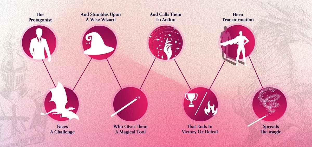
Our goal as the NARRATOR in the Message Phase is to identify the customer’s character and the problem (or the VILLAIN) in your customer’s life. What is a problem your customer deals with that relates to your services? We position you as the GUIDE who gives them a PLAN to overcome their problem. We then call your customer to ACTION – making a purchase or booking, giving, connecting, or learning more about your business through different functions on your site.
This phase is arguably the most crucial in our mission to understand your organization’s and your audience’s needs, and to design and develop a website that optimizes your goals by positioning your audience in the center and your business as the guide.
Making Your Story Count
After completing the Messaging Phase, we take your story and package it up in a homepage that can be shared with the world.
These are the five main sections that your homepage must include:
Section I: Header
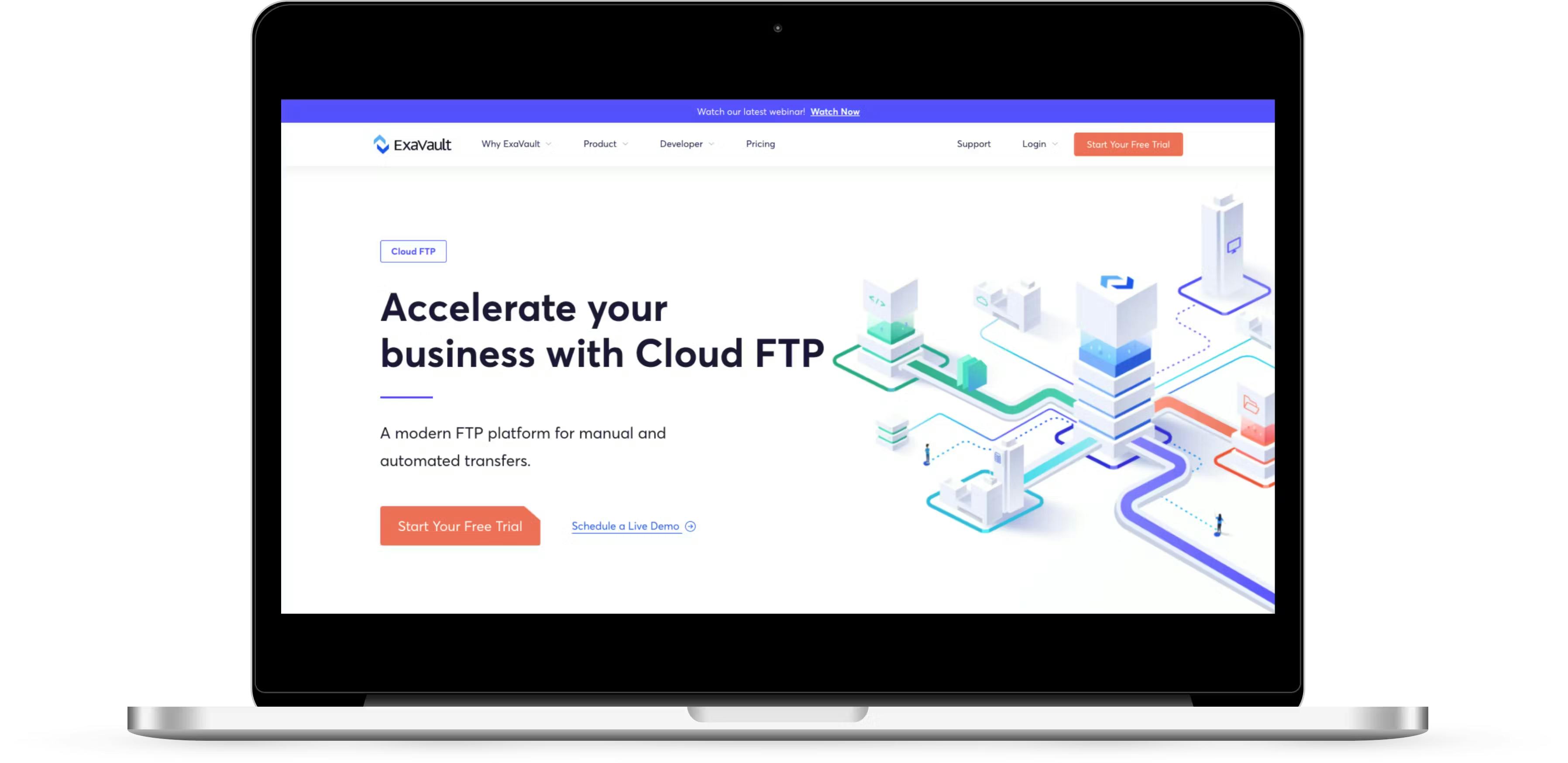
A powerful header needs to include who you are, what that means to your audience, and what they can do about it. A header could be portrayed as a powerful statement, an animation, or in a number of other creative ways, but must include those three elements. Remember, you are the GUIDE to help your audience come to SUCCESS.
Your header needs to be extremely clear and precise about what you are offering and how your audience can take you up on that offer. Save all the other bits of information for the lower portion. You want this area to be clean.
Section II: The Opportunity, or The Stakes
The Opportunity, or The Stakes section, is how you invite the user to work with you. Define the problem and how they can be a part of the solution that you offer.
Remember, establish yourself as the GUIDE by using empathy and authority to lead your audience to the PLAN. Even a statement as simple as “We care about you” will demonstrate empathy and develop trust in your audience.
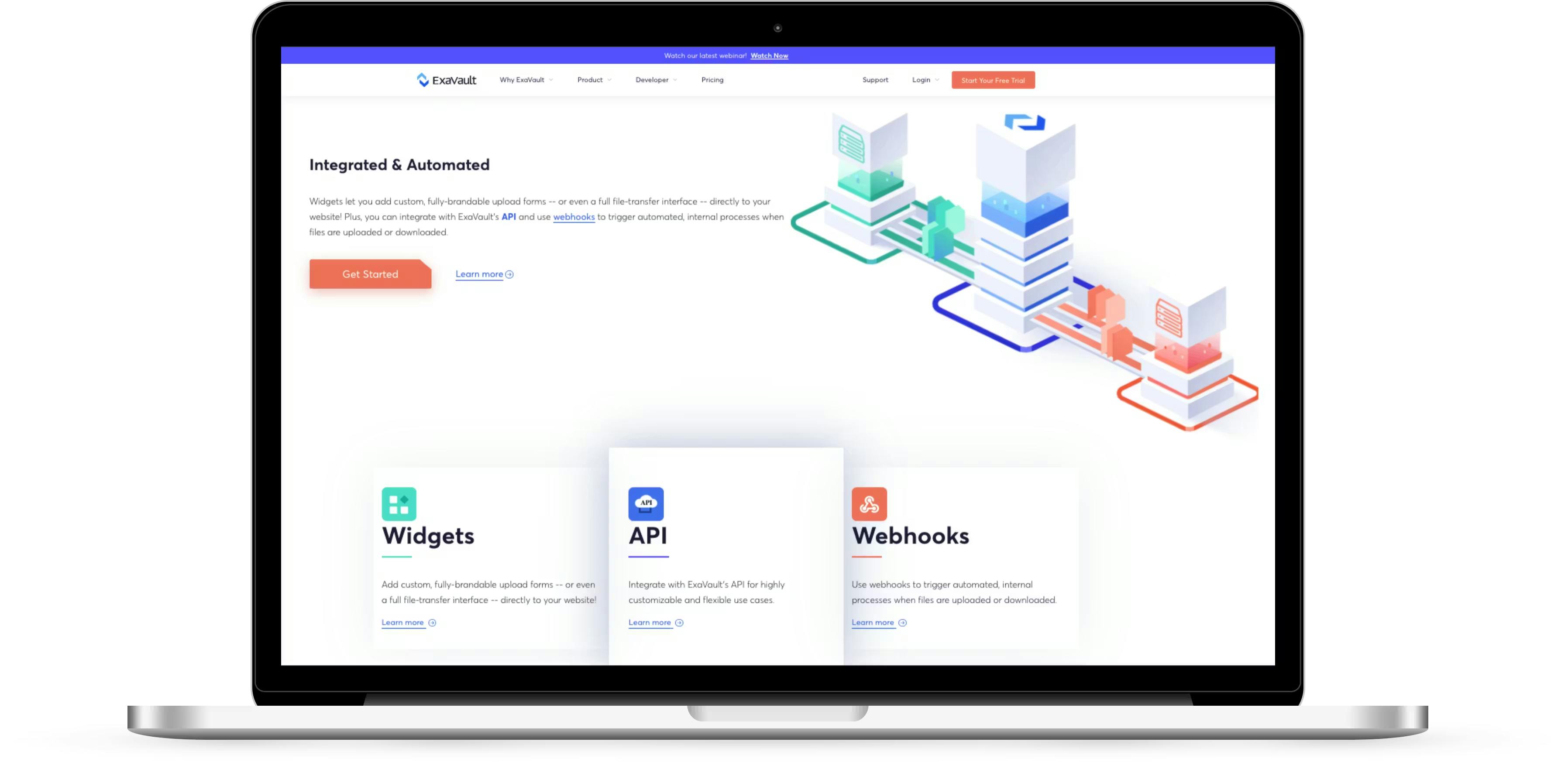
Section III: Solution (Departments or Products)
The Solution section displays the ways you can solve your audience’s problems. This section may include different products or departments that your company has.
Note that this is the first place your clients may experience an inner resistance, as there is risk involved for them now. Therefore, you’ll need to make sure you clearly demonstrate that it’s not hard to work with you. Make all offers clear and simple.
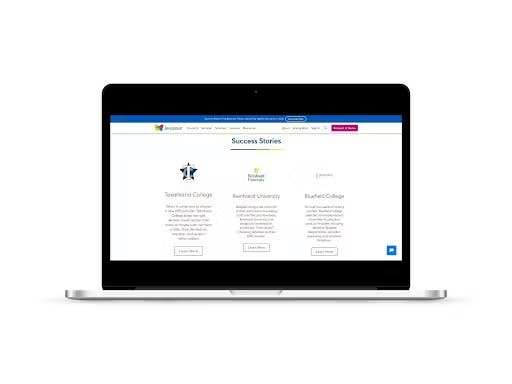
Section IV: Guide
The Guide section’s purpose is to set your business up as the GUIDE and gain the audience’s trust as you lead them to the solutions that they need. Essentially, this section should exemplify your competency. This is where you gain your viewers’ trust with case studies or testimonials.
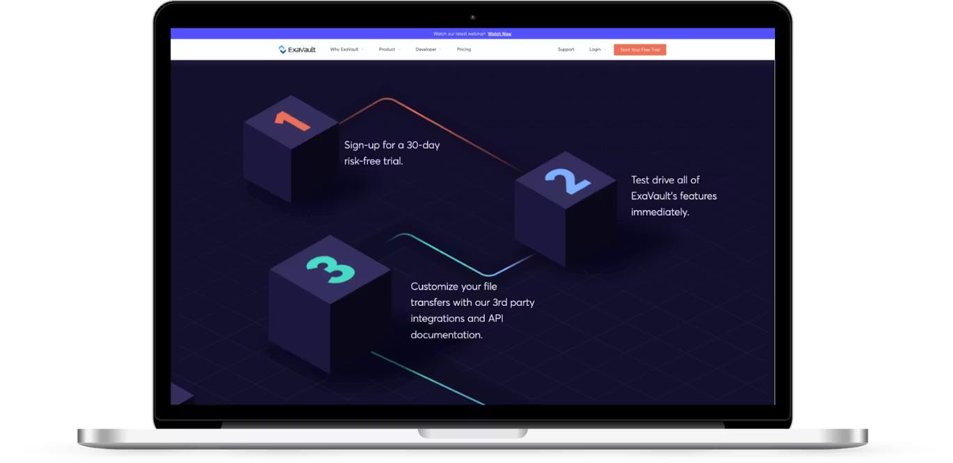
Section V: Plan
In this section, you want to give your audience clear steps to the solution and to working with you. The PLAN’s purpose is to lay out a distinct, three-step process that leads the audience to take an ACTION. People are much more likely to take an ACTION if they have a clear path to it. You will be surprised how setting out three easy steps can increase your conversions.
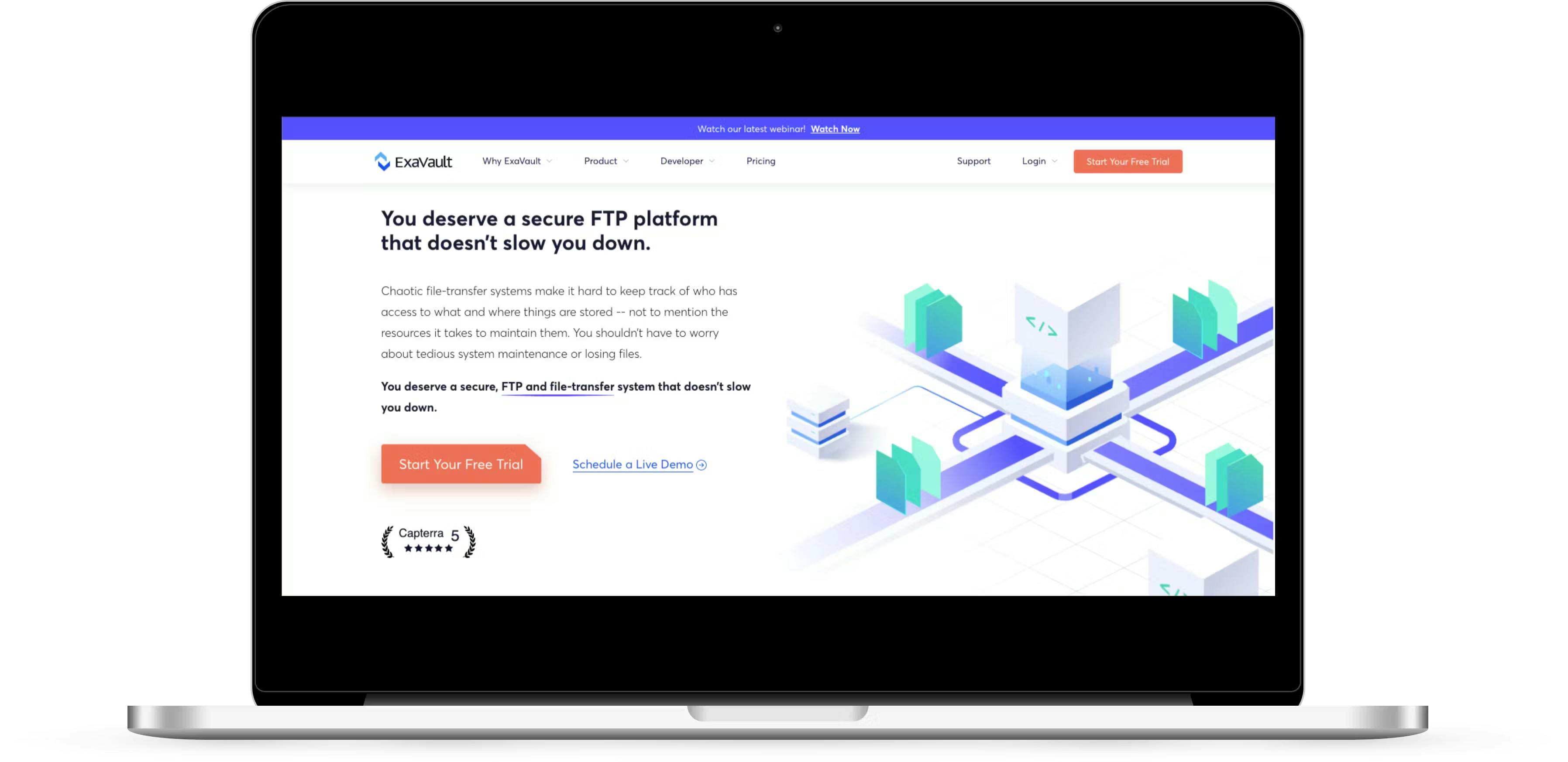
Section VI: Primary Call to Action
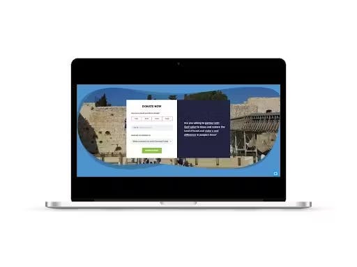
The Primary Call to Action is where you encourage your audience to take an ACTION: BUY NOW, GET IN TOUCH, DONATE NOW, etc. All of the previous sections build up to this peak. Remember, you want this to be clean, clear, and easy for your audience to understand.
Section VII: Transitional Call To Action
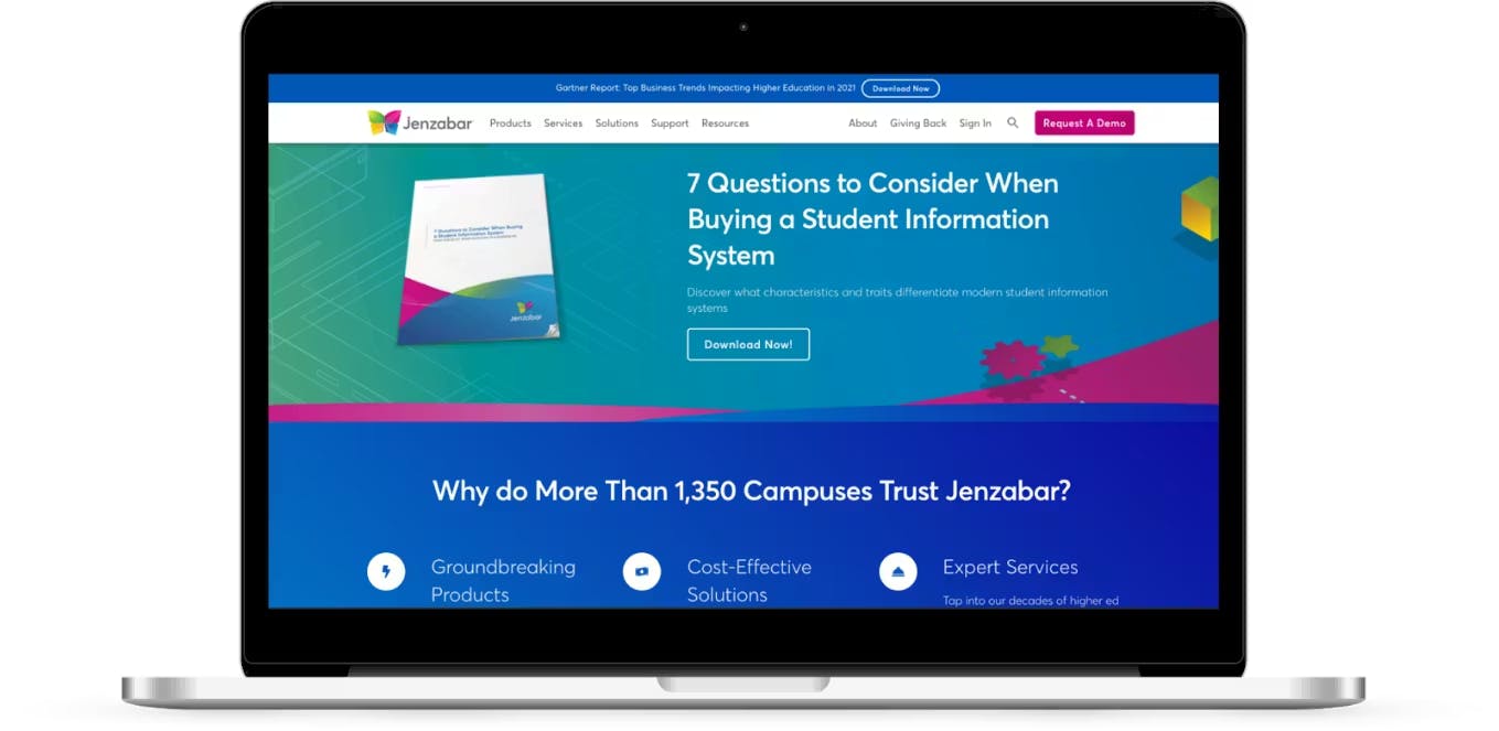
The purpose behind the Transitional Call To Action (“CTA”) section is to keep an open conversation going with your audience if they didn’t go for your Primary CTA section. This way, you don’t lose them. Maybe they aren’t yet ready to take that big step with you. For example, if you’re trying to sell a product, but it is out of your potential client’s budget at that point in time, they can receive a free e-book in the meantime by simply giving you their email address.
A Transitional CTA section could be a free resource, a trial period, or something of value that you give away in exchange for their email address. It could be a template, an in-depth video guide, or a booklet. The email addresses you collect can then be used in your email campaigns to capture further sales.
But what about the rest, like “job opportunities” or “meet the team”? There is still room for those, but place them at the bottom or on a separate page. Remember that the main purpose of your homepage is to communicate to your audience the primary ACTION you want them to take (i.e., BUY NOW or DONATE NOW).
" Remember that the main purpose of your homepage is to communicate to your audience the primary ACTION you want them to take (i.e., BUY NOW or DONATE NOW) "
It can be tricky to create a homepage that grabs an audience and makes them customers, but it is possible! Using the HeroGuide philosophy and these simple yet critical sections, you’ll create a homepage that tells your story and helps you and your clients achieve your goals.
If you are interested in updating and expanding your website’s capabilities, contact us for a free consultation.
*Gitte Lindgaard, Gary Fernandes, Cathy Dudek & J. Brown (2006) “Attention web designers: You have 50 milliseconds to make a good first impression!”, Behaviour & Information Technology, 25:2, pp.115–126, DOI: 10.1080/01449290500330448.


